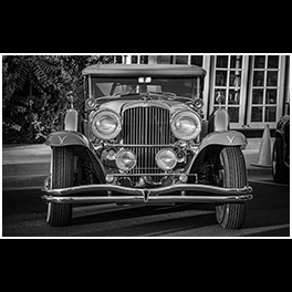
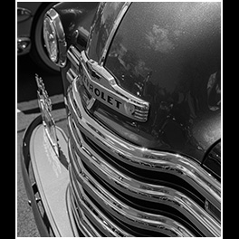
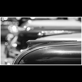
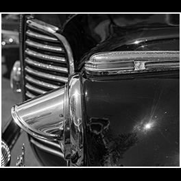
photos from joshua l. smith


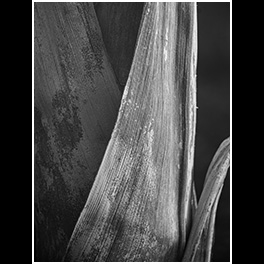
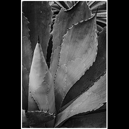
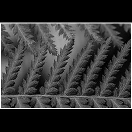
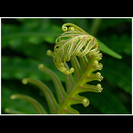
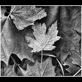
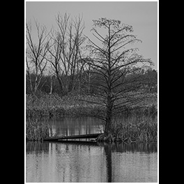
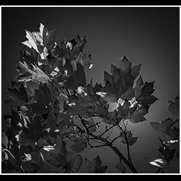
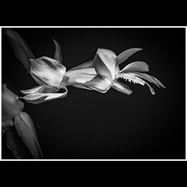
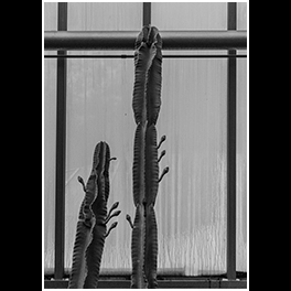
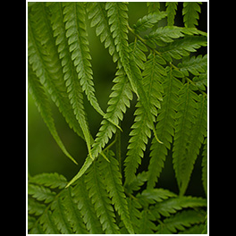
Not every image needs to be award winning; I enjoy looking for abstract compositions, and I’ve photographed this type of plant quite a few times and rarely gotten an image that I liked. But I really like this image – award winning to me.

I don’t ever shy away from editing an image from cropping to color correction to contrast; I almost never show an image before editing.
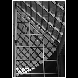
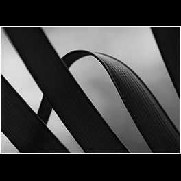
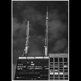
But every once in a while a scene presents itself that needs no editing, like this one. I did crop this, my lens simply didn’t have the reach for the crop that I wanted; and of course, I changed it to black & white. Some won’t like this image, even more will find an aspect to critique; and that’s fine, after all art is subjective.

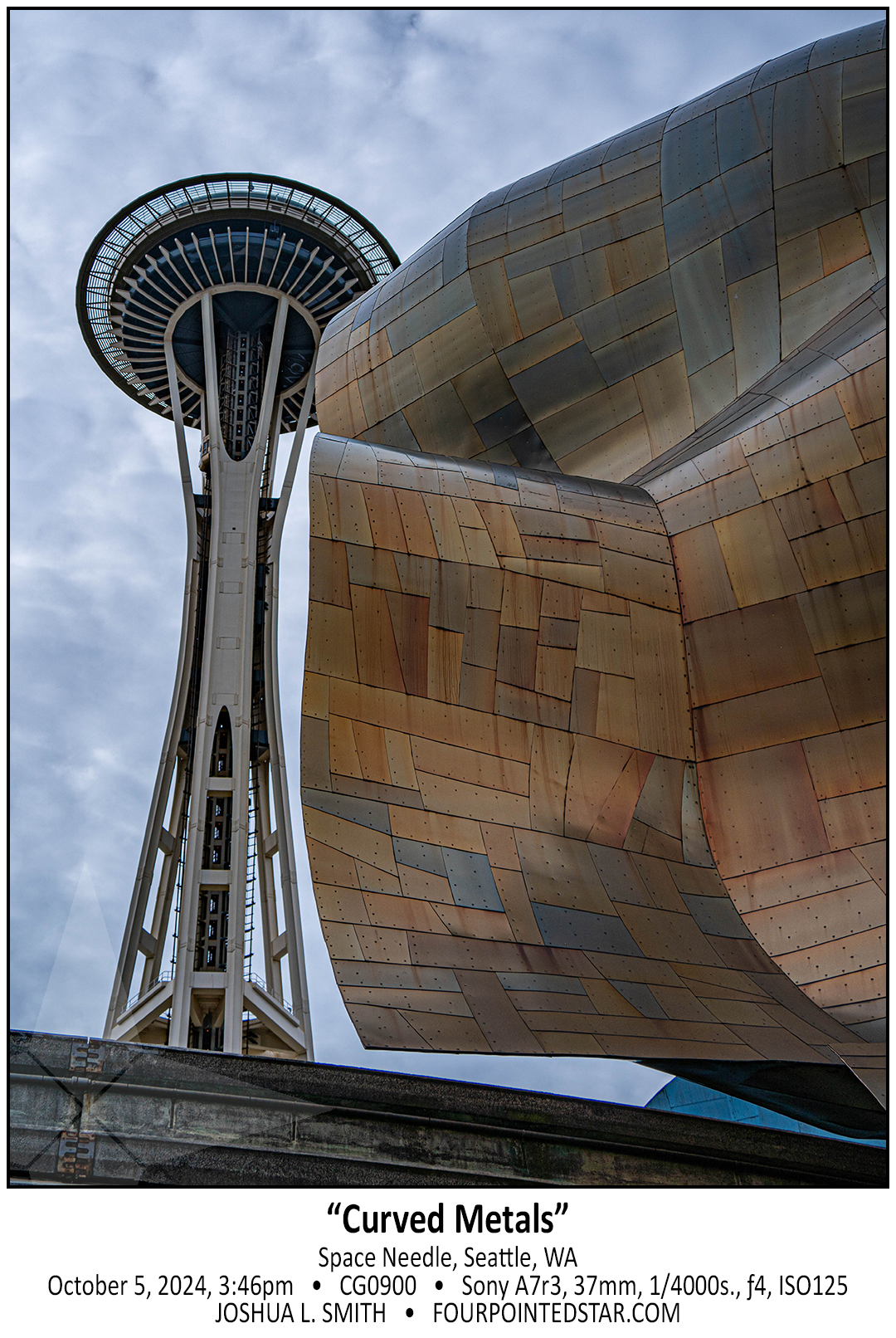
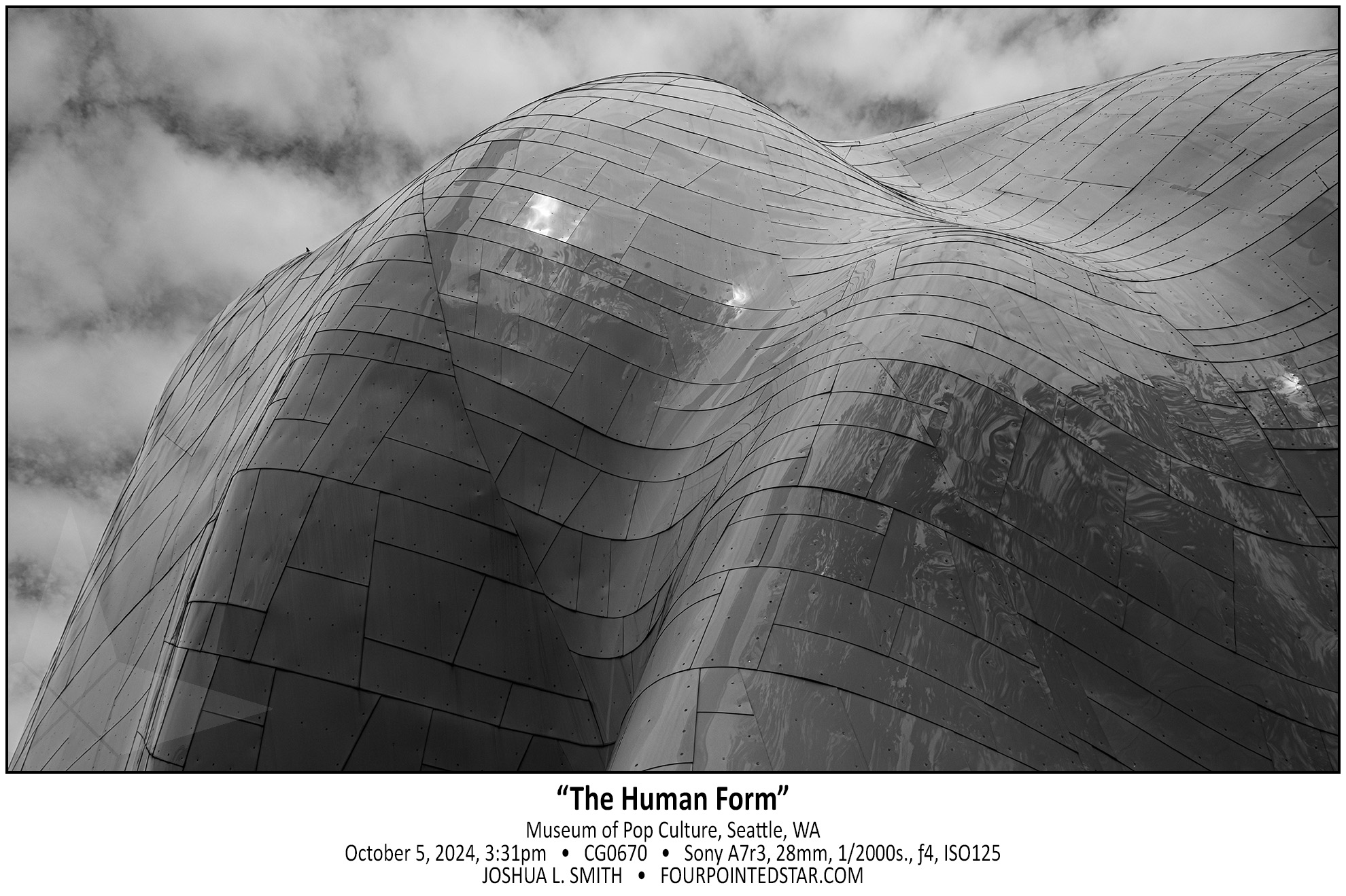
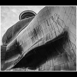
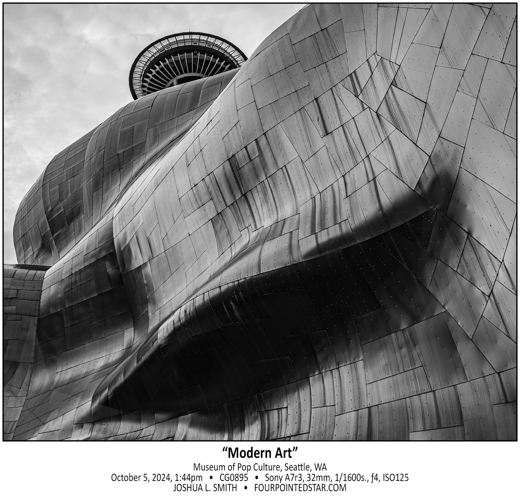
As you fly over the midwest, you can see a patchwork of farmland, roads, and rivers creating right angles and natural curves across the earth. Perhaps that’s why I enjoy this photo so much, it reminds me of the mixture of manmade and natural shapes. The weathered run off from the rivets just adds a little pizazz too.

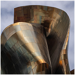
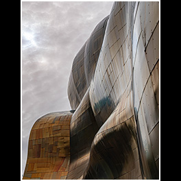
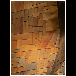
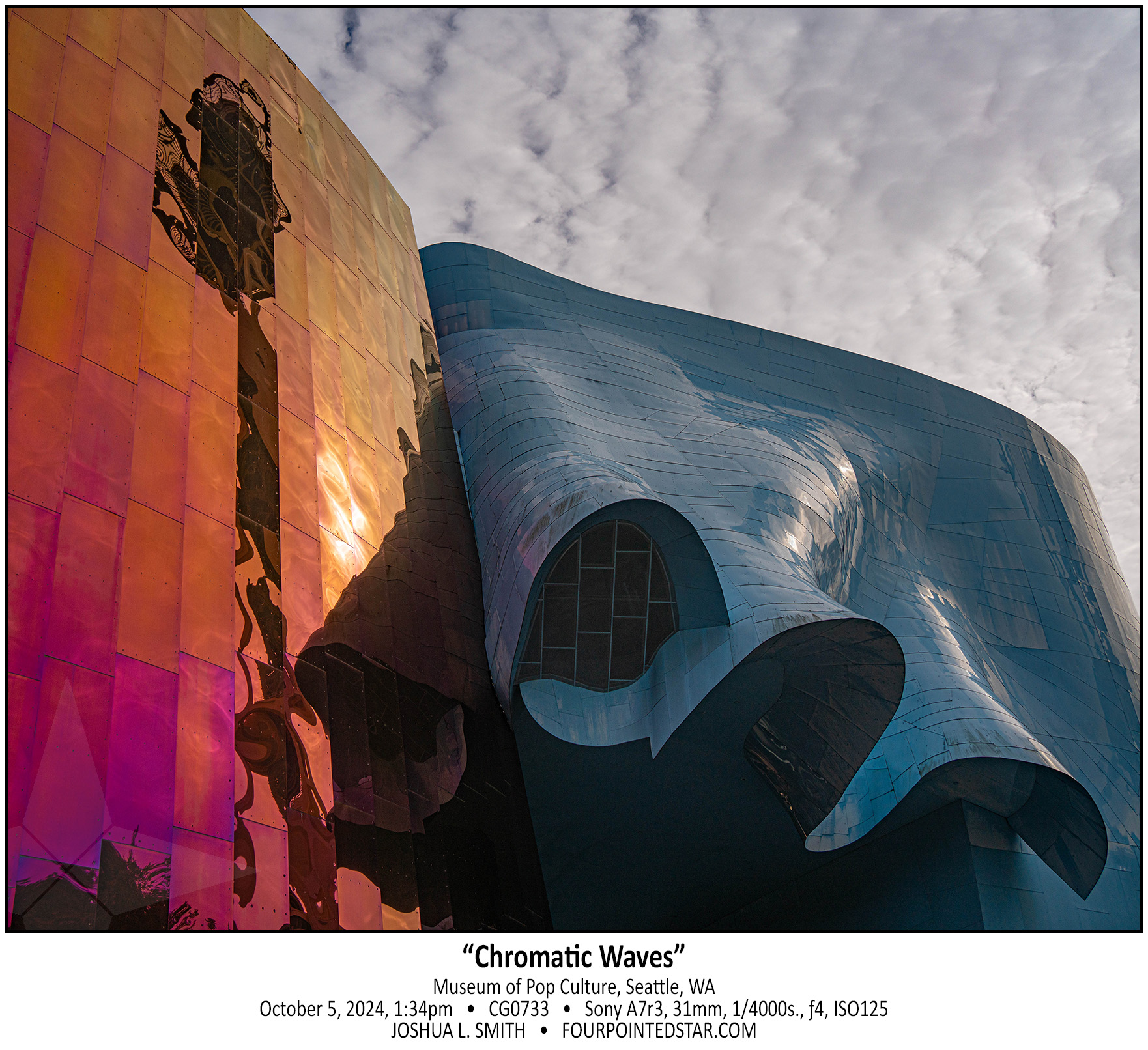
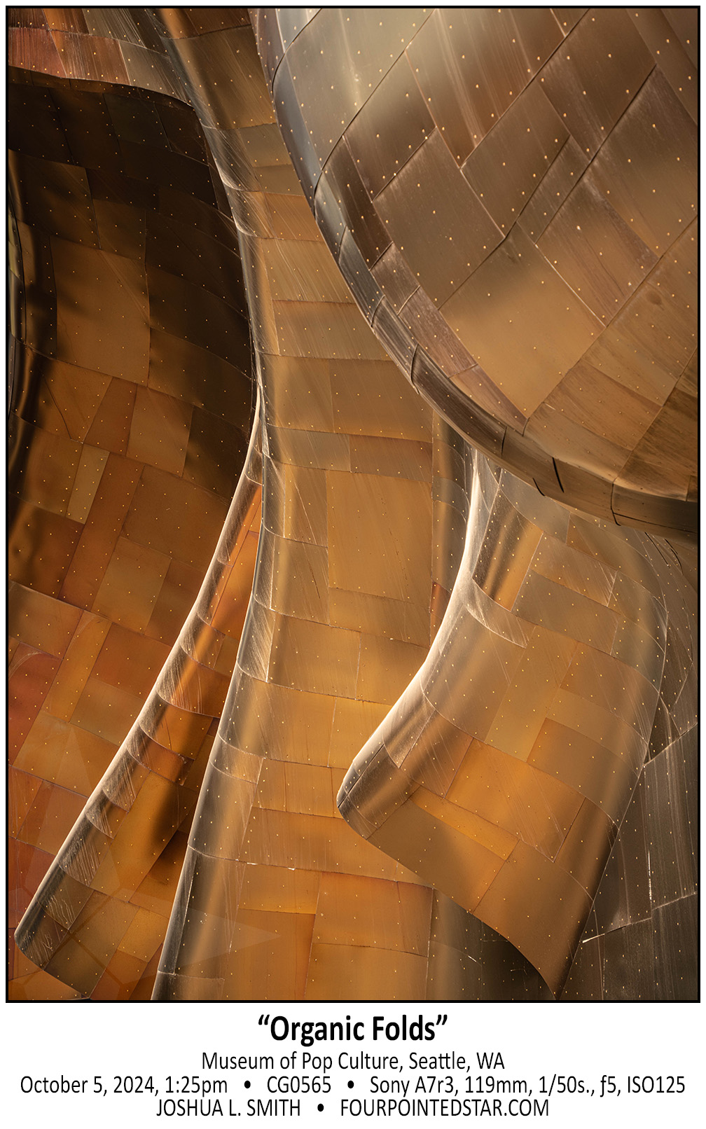
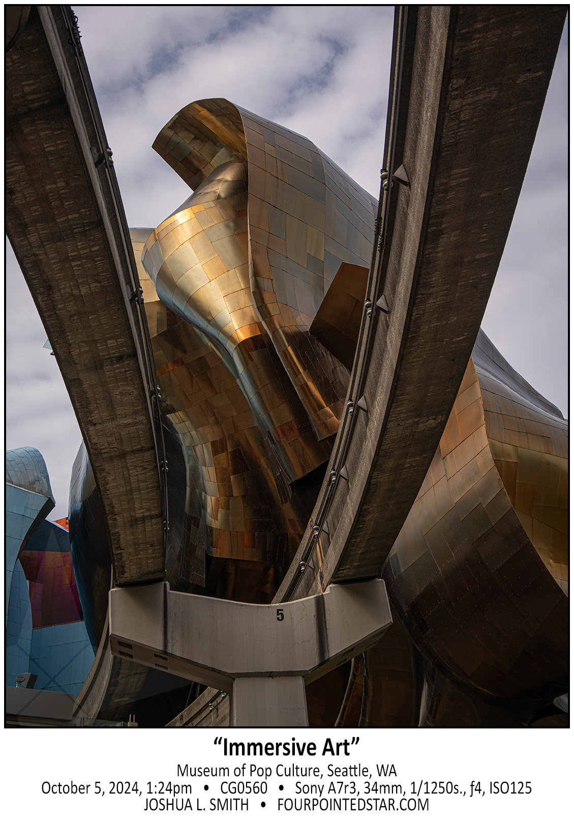
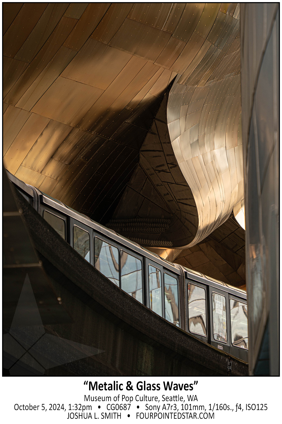
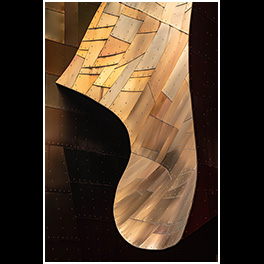
As the sun faded in and out of the cloud cover throughout our walk around the museum, the colors of the metal would change. The building would reflect the blues, yellows, and greys in the sky and then my Sony would attempt to record those colors as photographs. As I was editing the images, I found so many fun and fantastic color combinations; in this image, you can see the golds, coppers, and silvers as well as the grey, blue, and yellow in the clouds.
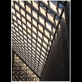
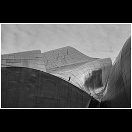
I struggled with editing this image. I love the composition, but getting the dark and light not too dark and not too light was a challenge; and I still don’t think I’ve got it right. The light parts just aren’t light enough, and I’ve always struggled with getting monochrome images to have nice lighter parts of the image without having just a texture-less white space. Each photograph teaches us a lesson and often that lesson is “you have a lot more to learn.”

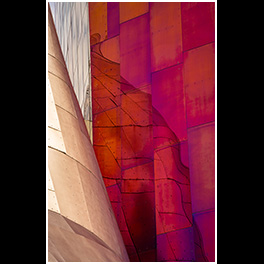
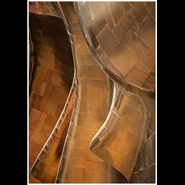
I love the warble of reflected lines in glass, but it brought a smile to my face to discover the same thing happens with metals. The straight lines of the fantastic red-ish hues stand out against the reflected copper lines. I’ve photographed this exact phenomena in many windows but finding it present in steel was simply wonderful.

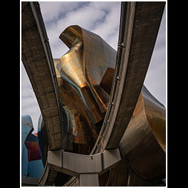
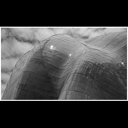
Unlike most of Frank Ghery’s most famous buildings, the Museum of Pop Culture is not simply shades of shimmering silver. The building has 5 or 6 unique segments in different colors, each segment with his signature curves and waves. Shadows and reflections wandered across each curve and surface, combining to form a lasting smile across my face.

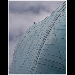
This pigeon has decided that sitting on the top of this metal cloud is a great way to interrupt my photo. At first I was annoyed, but now I enjoy the tiny interruption – almost like it’s Monty Python’s French Taunter in the castle castle threatening “I blow my nose at you!”
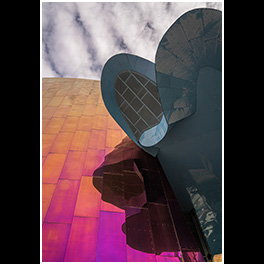
Ghery’s architectural works stand out in any skyline. The multiple colors, textures, and waves on the Museum of Pop Culture exhibit a wonderful feast of the eyes. While many of his buildings and designs are similar to the Pritzker Pavilion here in Chicago – mostly uniform in color – the Seattle design has multiple treatments and colors for the sheet metal. As we walked around the exterior, I found dozens and perhaps hundreds of potential abstracts, and after editing, here are a few that stood out as spectacular.
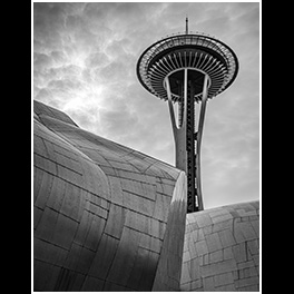
As you walk away from the Seattle Space Needle, you’re treated to the chrome and copper variations in the anodized metal. The waves and variations reminded me of a patchwork quilt that has been tossed on the couch; almost as if the wind had blown the building into that particular spot in Seattle’s downtown.

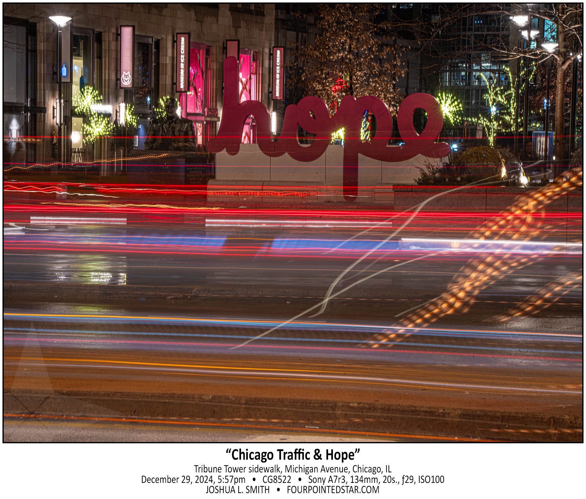
I enjoy the rotating art displays in the courtyard between the Tribune Tower and the Apple Store on Michigan Avenue. Seeing “hope” in such a central point of the city is a wonderful reminder of something that we have to work at, to hope for a better future.
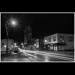
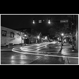
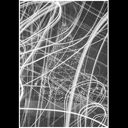
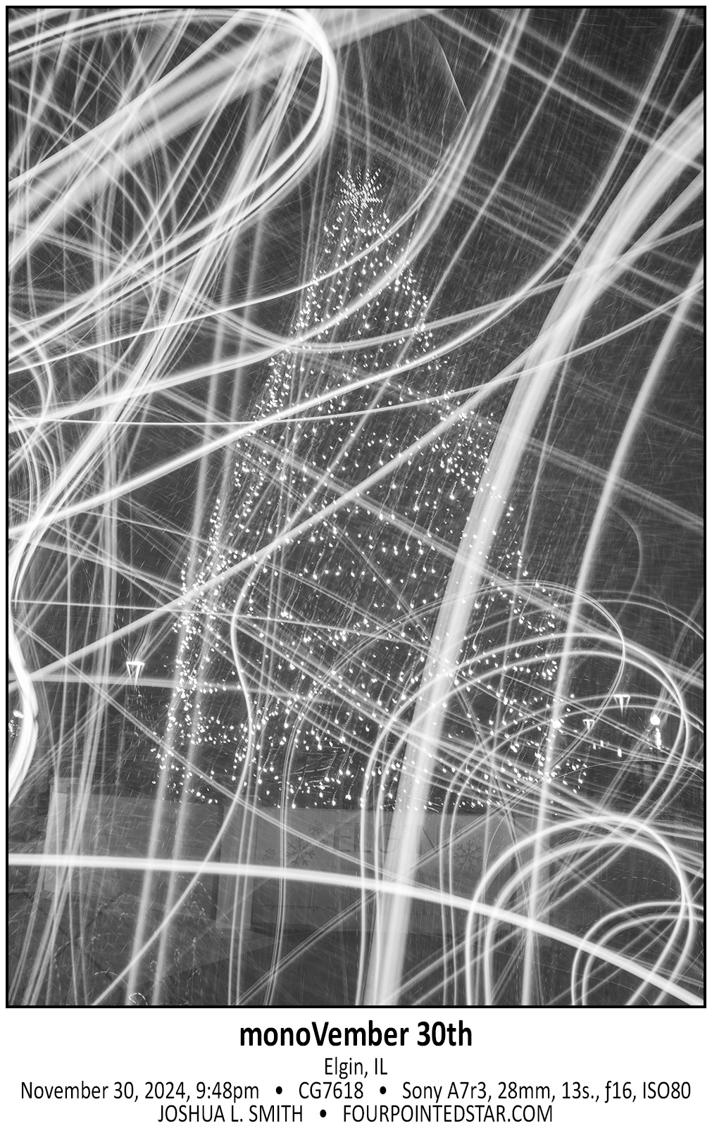
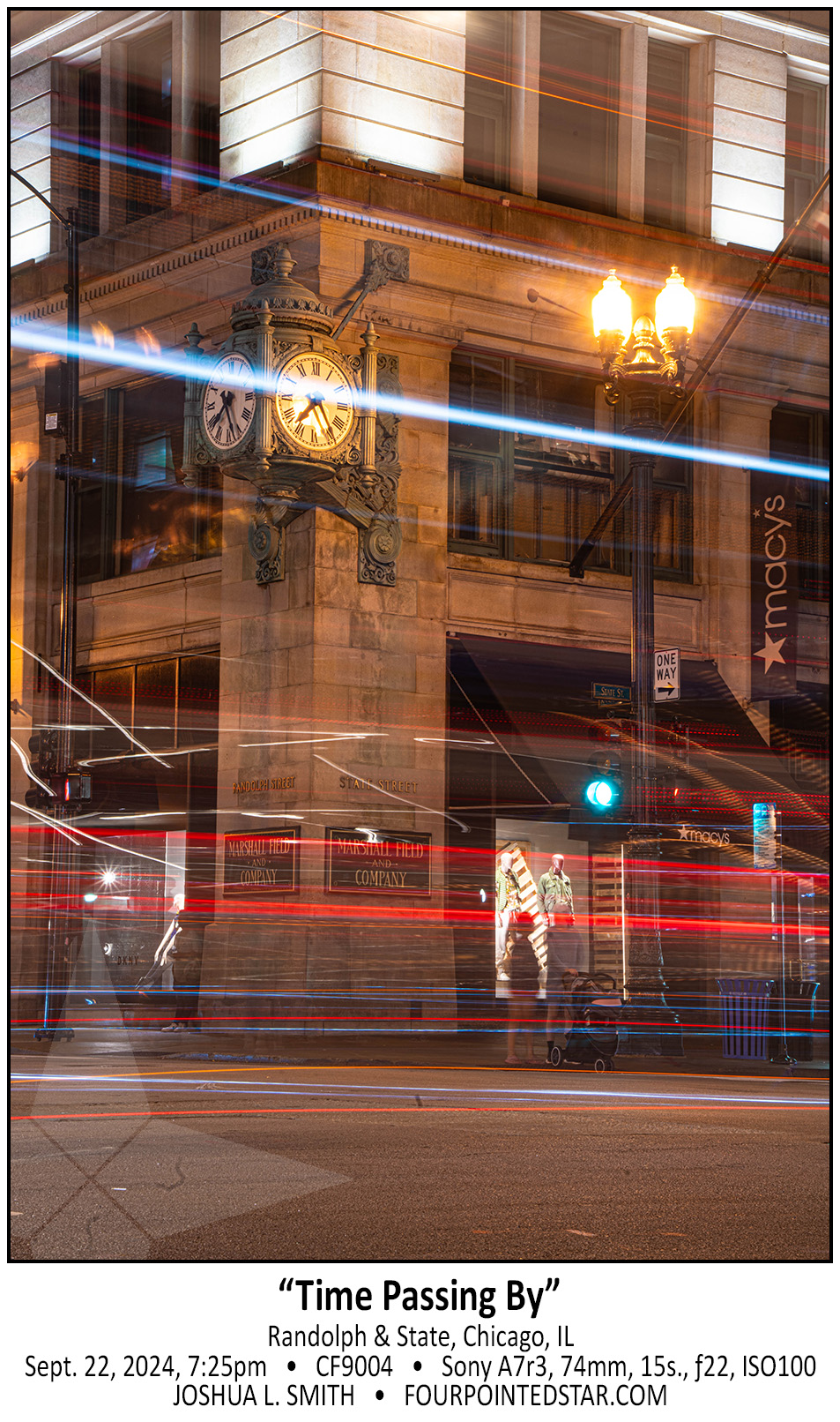
And of course, I had to shoot some light trails on any walk through Chicago!

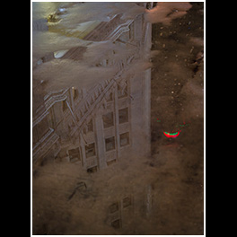
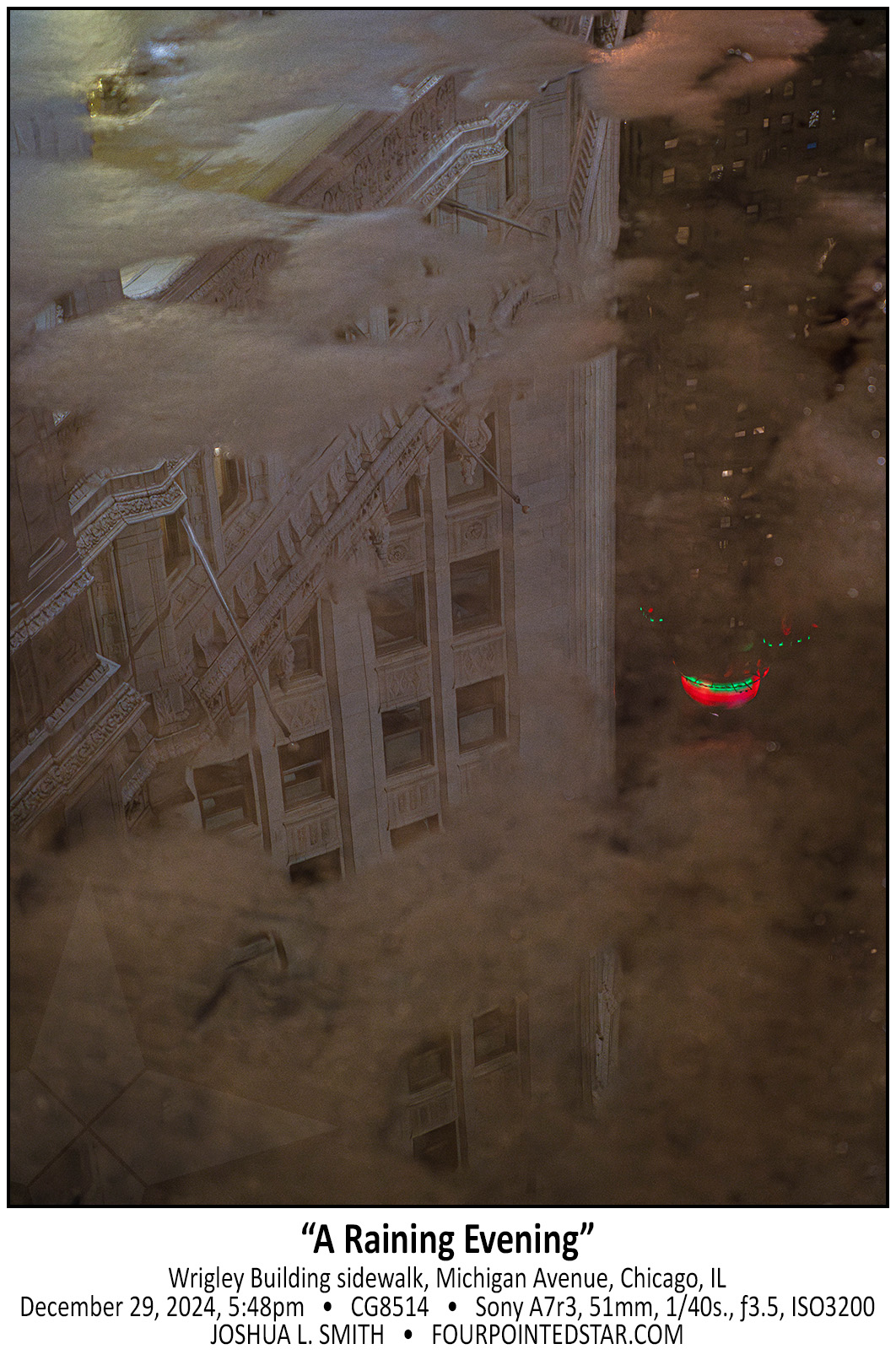
On a previous photo walk (which was also rainy), Arnaldo took a few photos of reflections in the water; and as I waited for the December photo walk to begin, I noticed this perfect reflection. I considered asking someone to step in the puddle, but decided that the Wrigley and InterContinental buildings were a great composition.

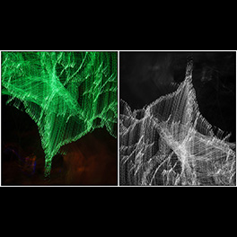
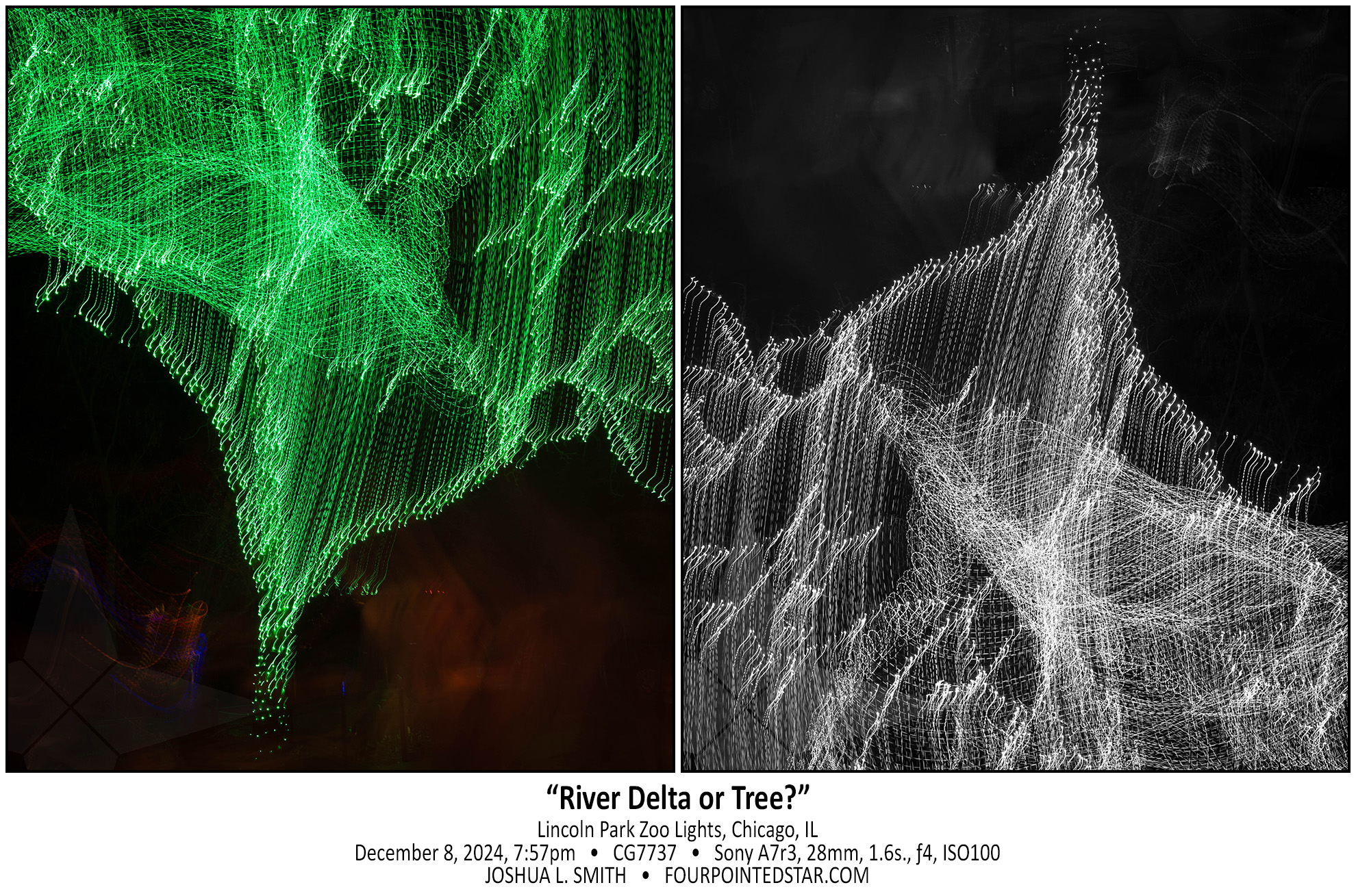
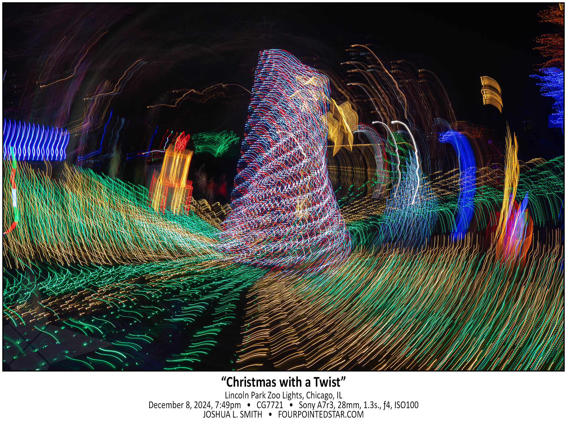
When I attended the Lincoln Park Zoo Holiday Lights exhibit, I wanted to create something more than a record of someone else’s artwork. In the past, I have captured images that combined the lights with camera motion, and I wanted to take what I have learned in the past and apply it to this year’s visit. This abstracted tree gave me the opportunity to see the image as something more than “a tree wrapped in green lights”.

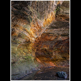
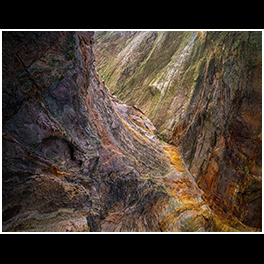
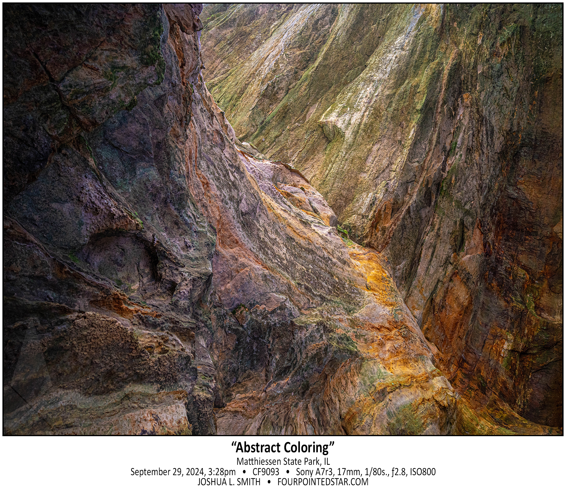
I’ve taken a few photos similar to this one; the abstract natural textures of colorful rocks. My favorite similar images are from Rockhouse Cave in Hocking Hills State Park, Ohio. But what struck me about this image is how much the color palette reminded me of the colors in renaissance art.


If someone asked me what my favorite image is from any given trip, I might have difficulty pointing to a singular image. But for the Seattle trip in October, this is “The Image”; I’m not even sure why. I simply love this photo – the entire trip was a photographic adventure, but this image stands above all the others in my mind.


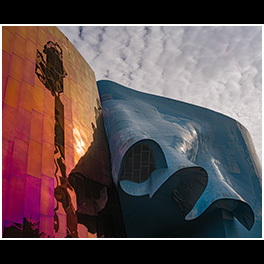
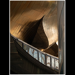
On the day that we visited the Museum of Pop Culture, the sky was perfect; bright sunshine diffused through high and wispy clouds. The muted sunlight was perfect for capturing the golden hue on the metallic waves; there’s another hundred compositions that could be made off of this building.

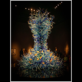
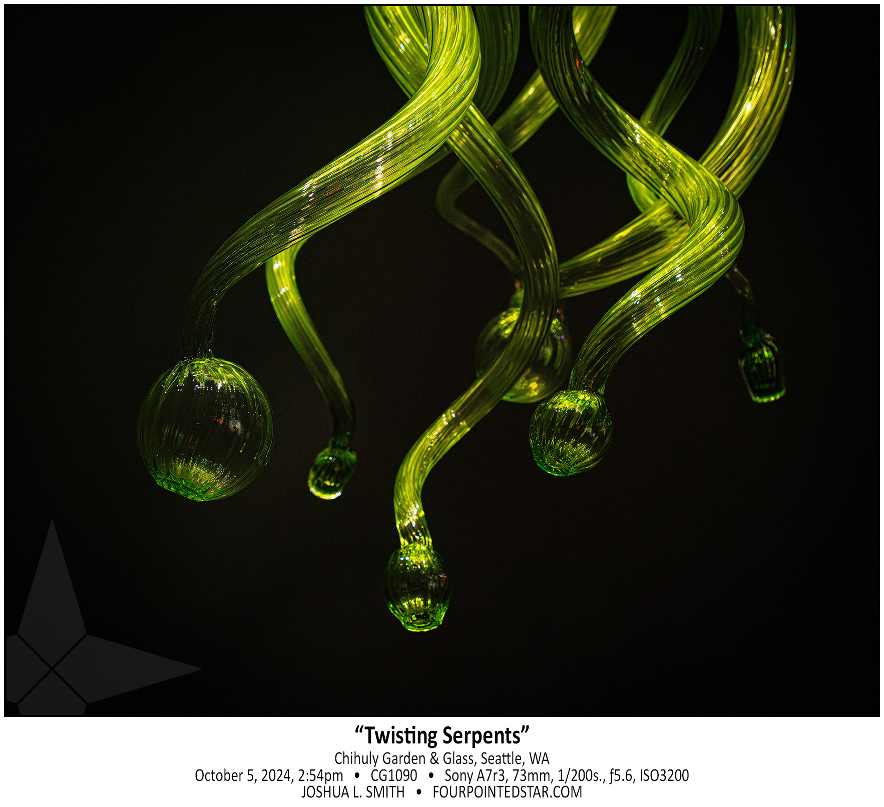
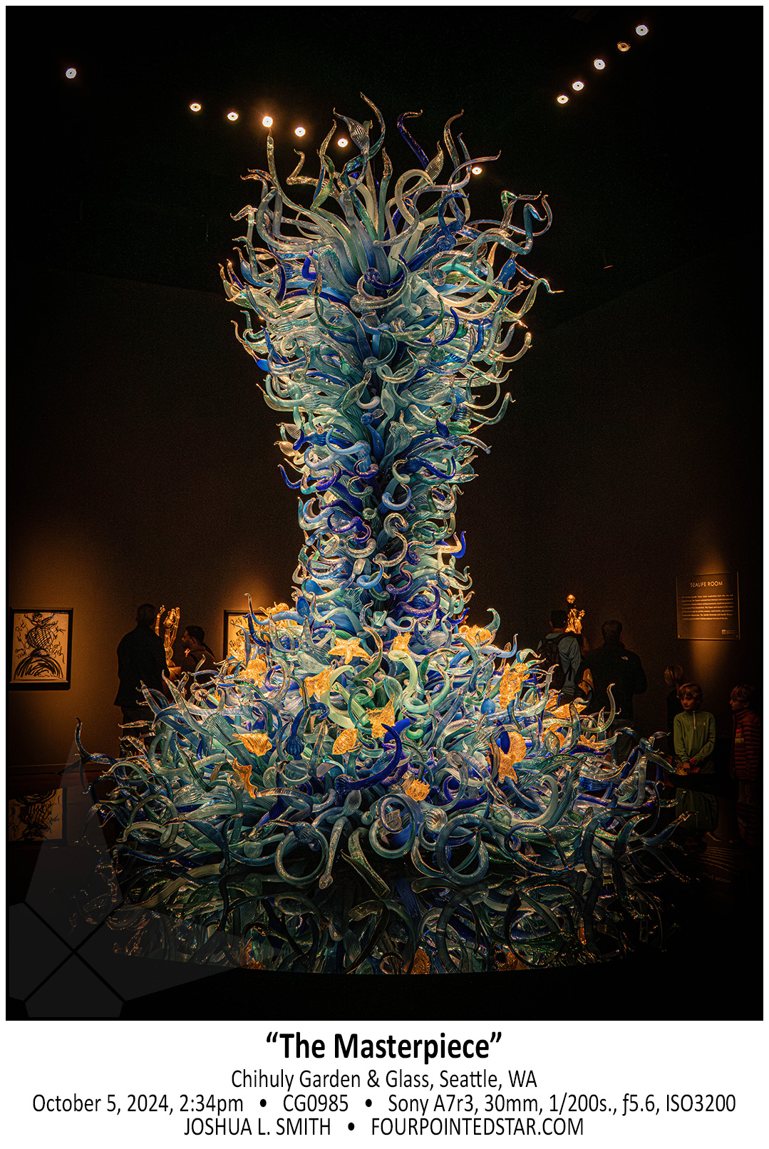
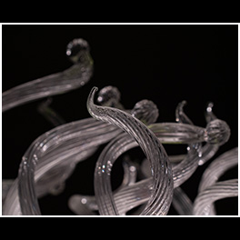
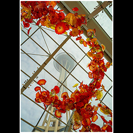
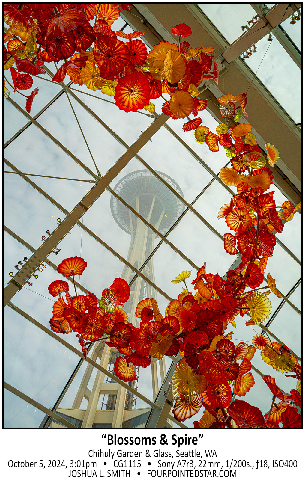
So many of Chihuly’s sculptures resemble sea creatures, but this gigantic creation actually has small fish and shells and other aquatic life integrated into the design. This is the first large creation that you see as you take the tour of Chihuly Garden & Glass, and it is awe inspiring!

I absolutely loved photographing the Museum of Pop Culture in Seattle; but I would love to photograph any of Frank Ghery’s buildings!


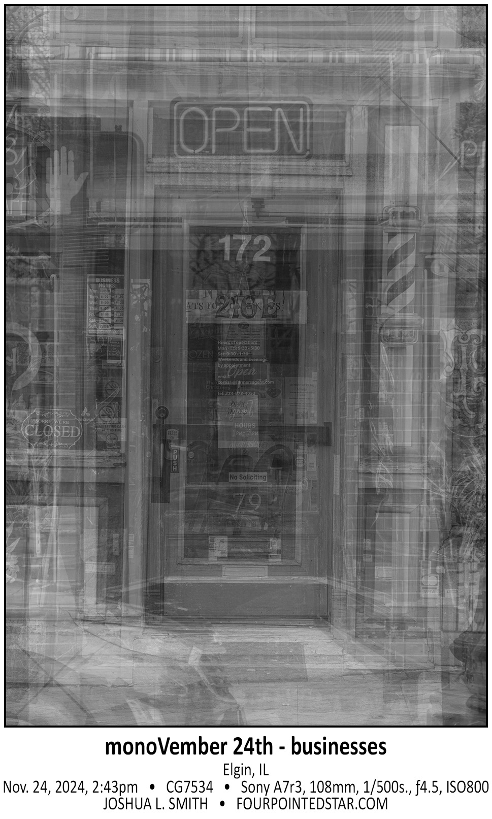
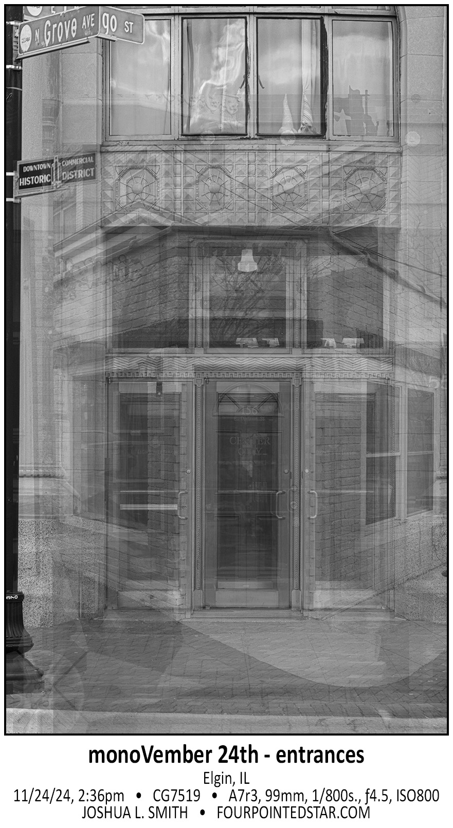
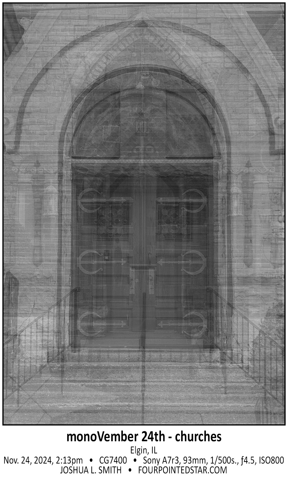
Today’s monochrome is a little different; Sarah and I walked through downtown Elgin and took photos of doorways. My original intention was to layer 24 downtown doorways (cause it’s the 24th, you know?) into one montage, but once I layered more than 6 or 8 images, enough details were gone that you couldn’t identify anything in particular. So I adjusted to 3 creations, 7 images each … and I really like the outcome.


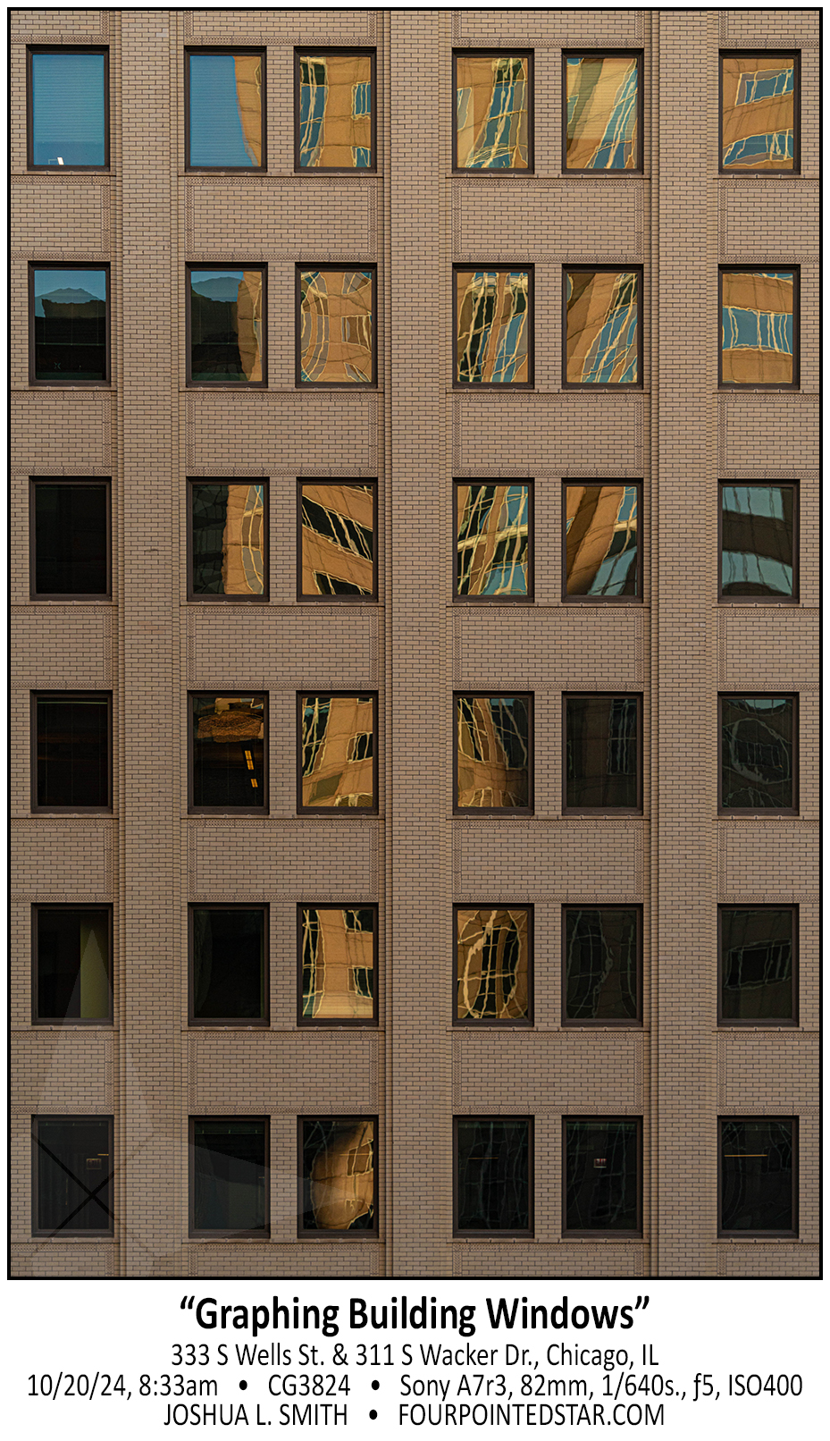
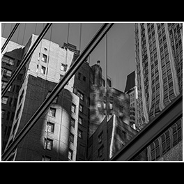
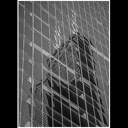
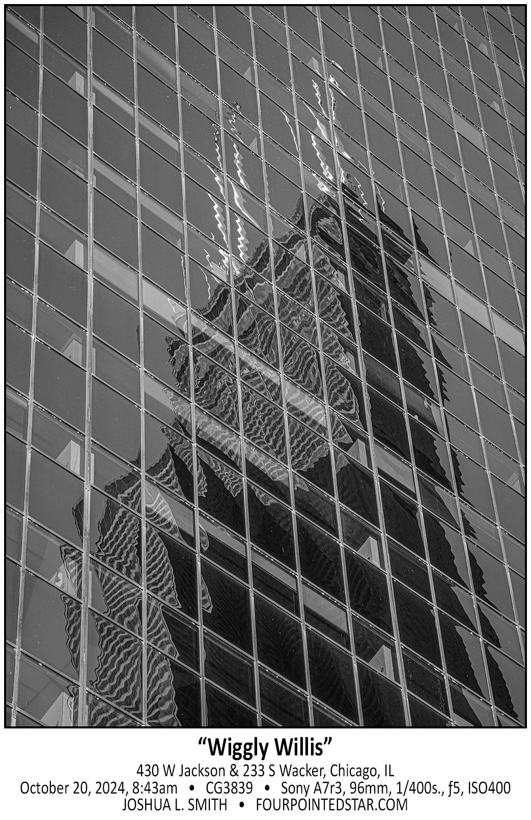
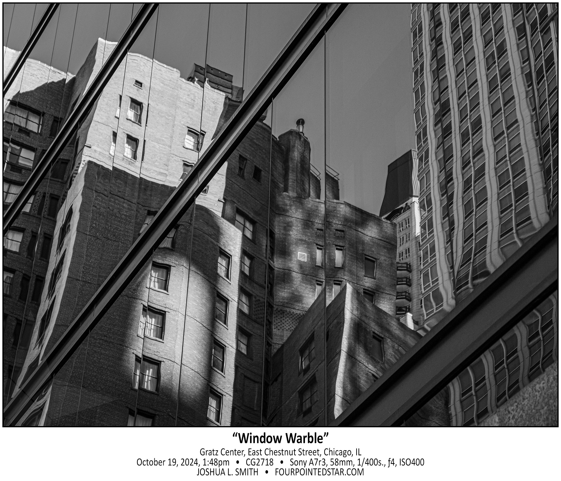
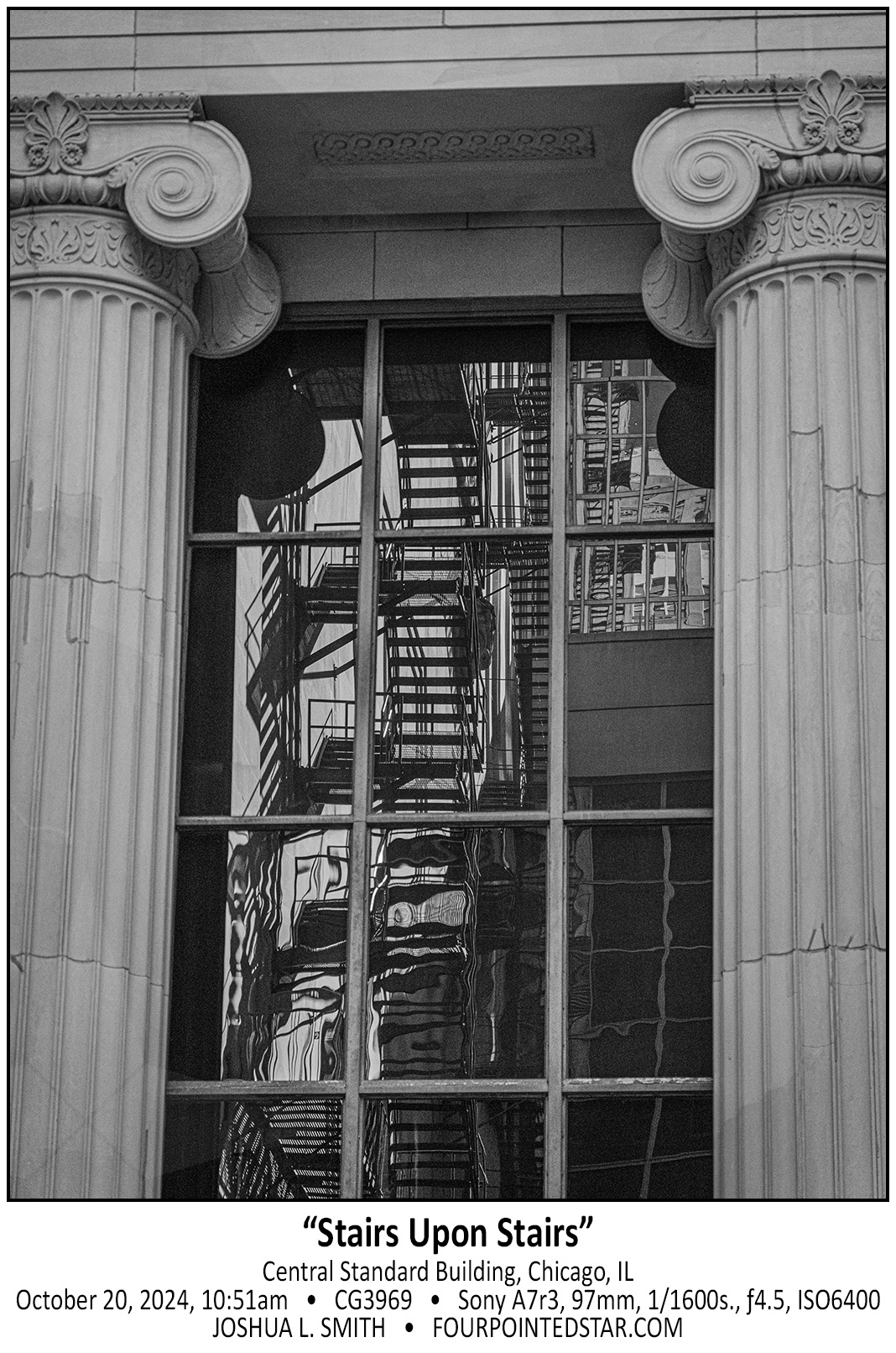
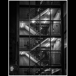
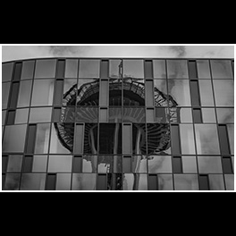
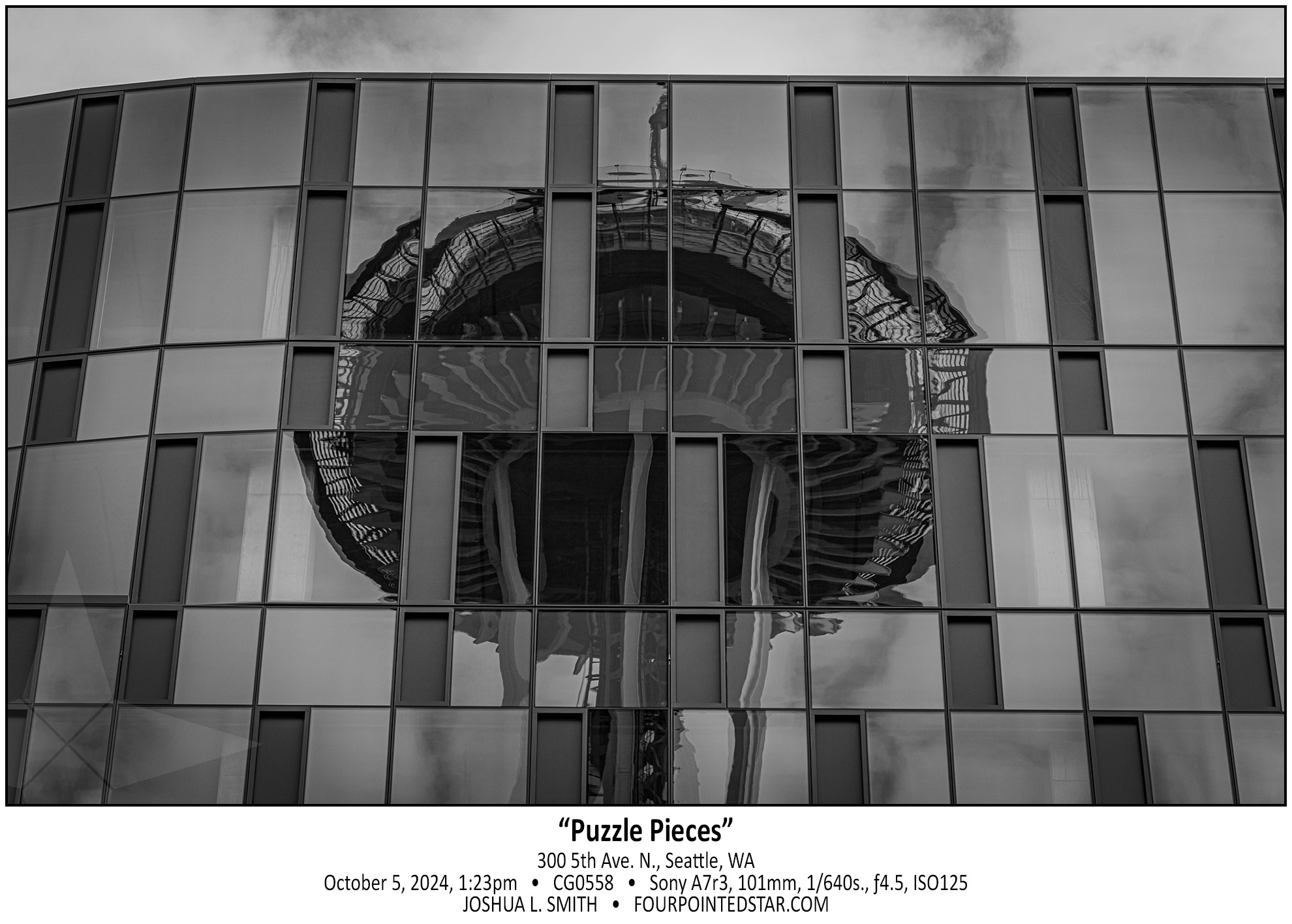
I suppose at this point, I’m kind of known for my “reflection distorted in glass” photos, but I really love this one. The monochrome makes the textures and details really stand out, and I absolutely love the architectural elements of the building as well.


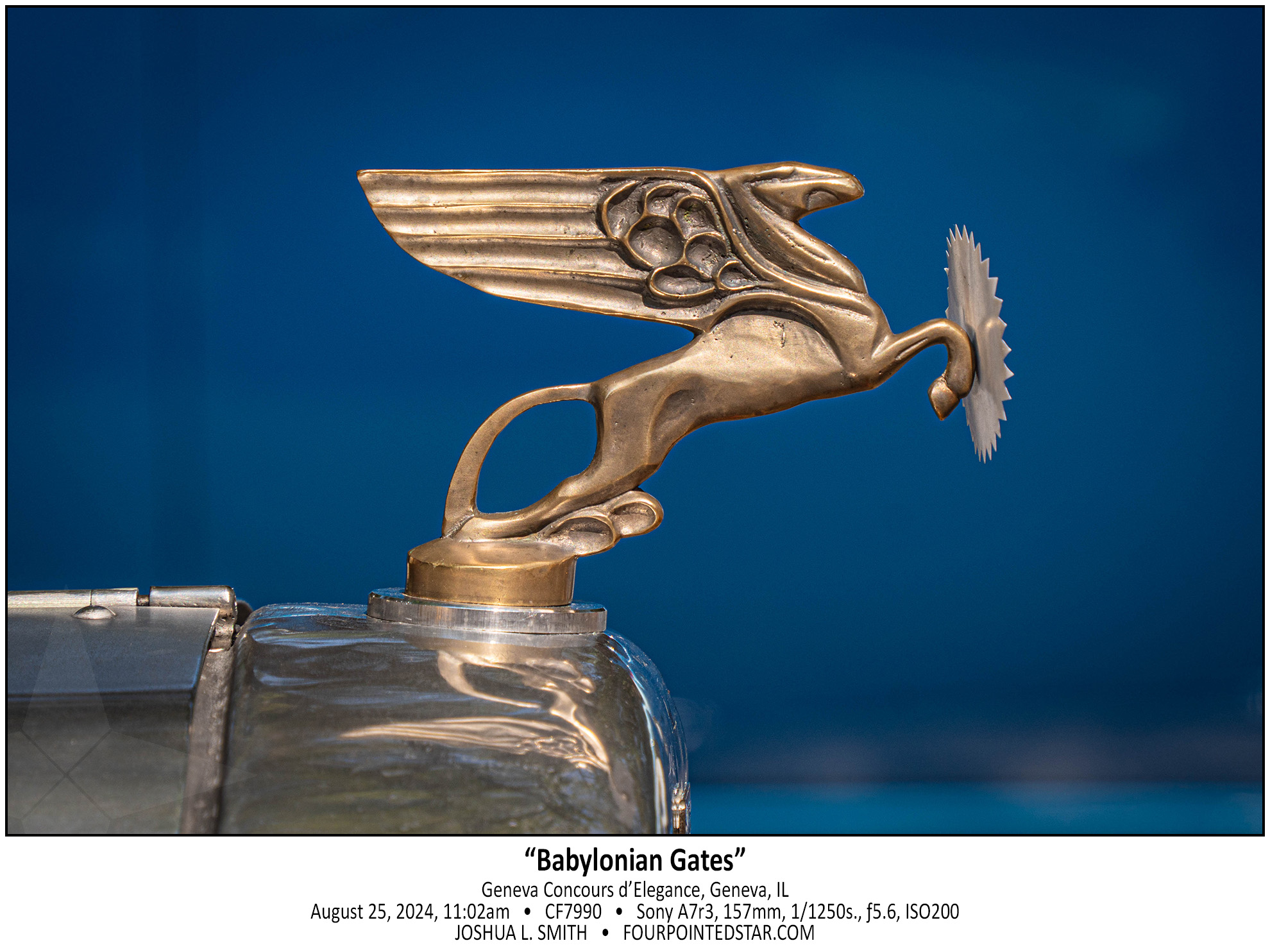
When I first saw this hood ornament, I immediately was taken with how fragile and sharp the front piece was. I was then taken with the luster of the copper color of the animal (perhaps a pegasus?). The copper color and the animal’s shape reminded me of the decorations on the Ishtar Gate, and placing that hood ornament with the rich blue backdrop really completed the enchantment.


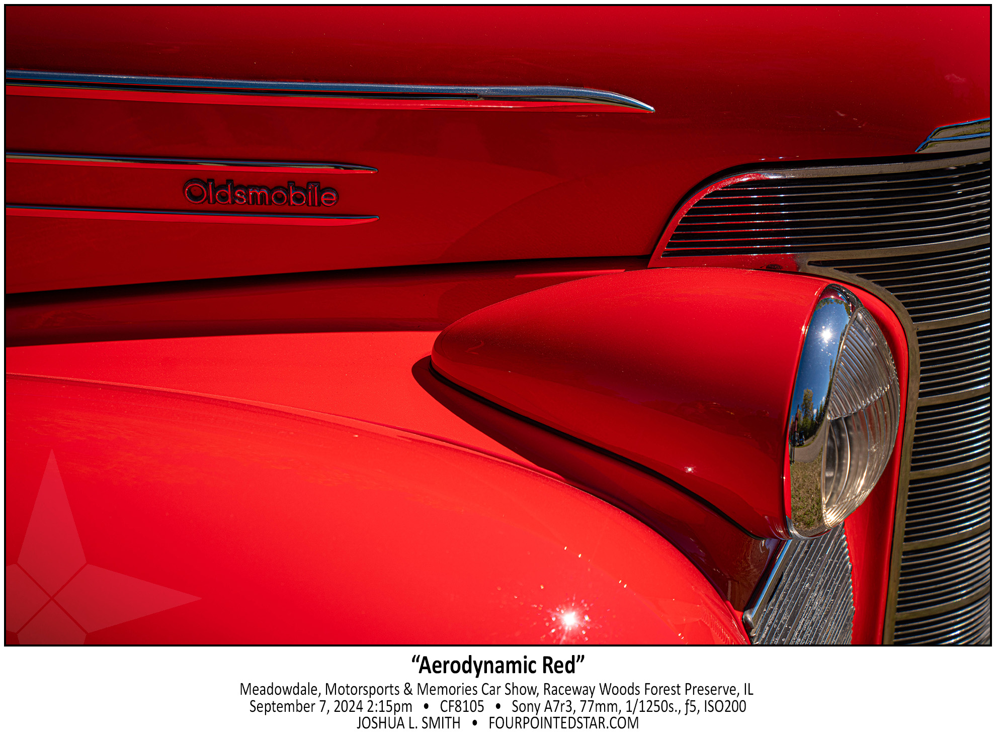
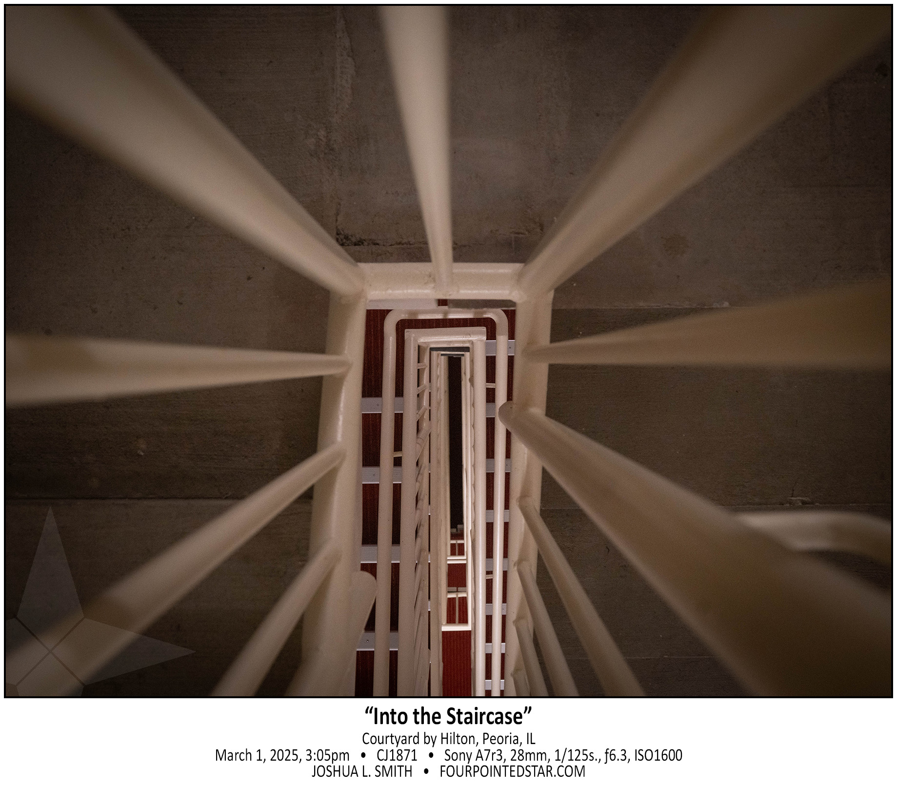
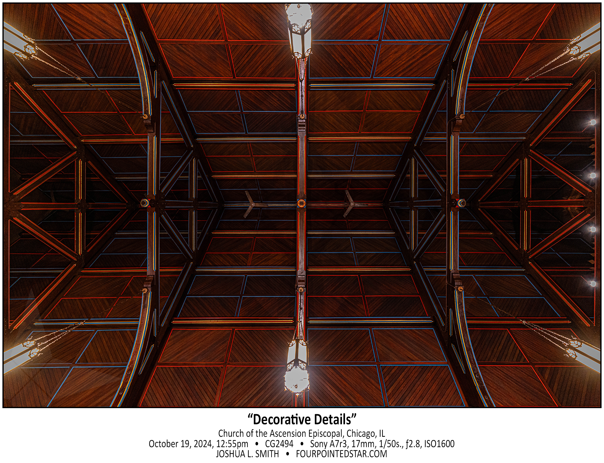
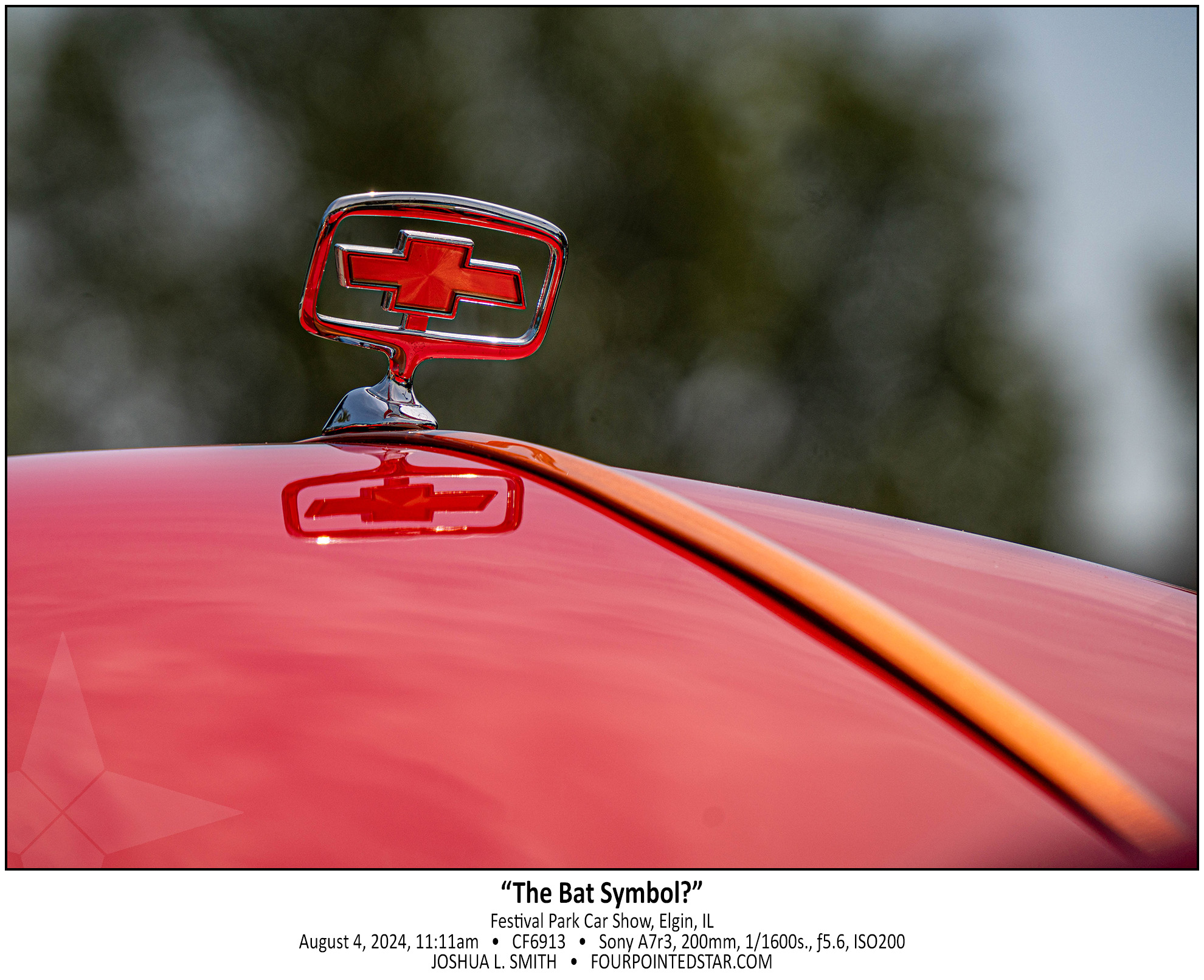
If you take a beginners’ photography class, your instructor is likely to bring up leading lines, rule of thirds, and removing items that aren’t needed as some of the keys to a great photo. I’d like to think that those are the reasons that I love this photo, but it’s probably only because I love the color red combined with the yellow hints in the center-line trim work.


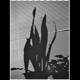
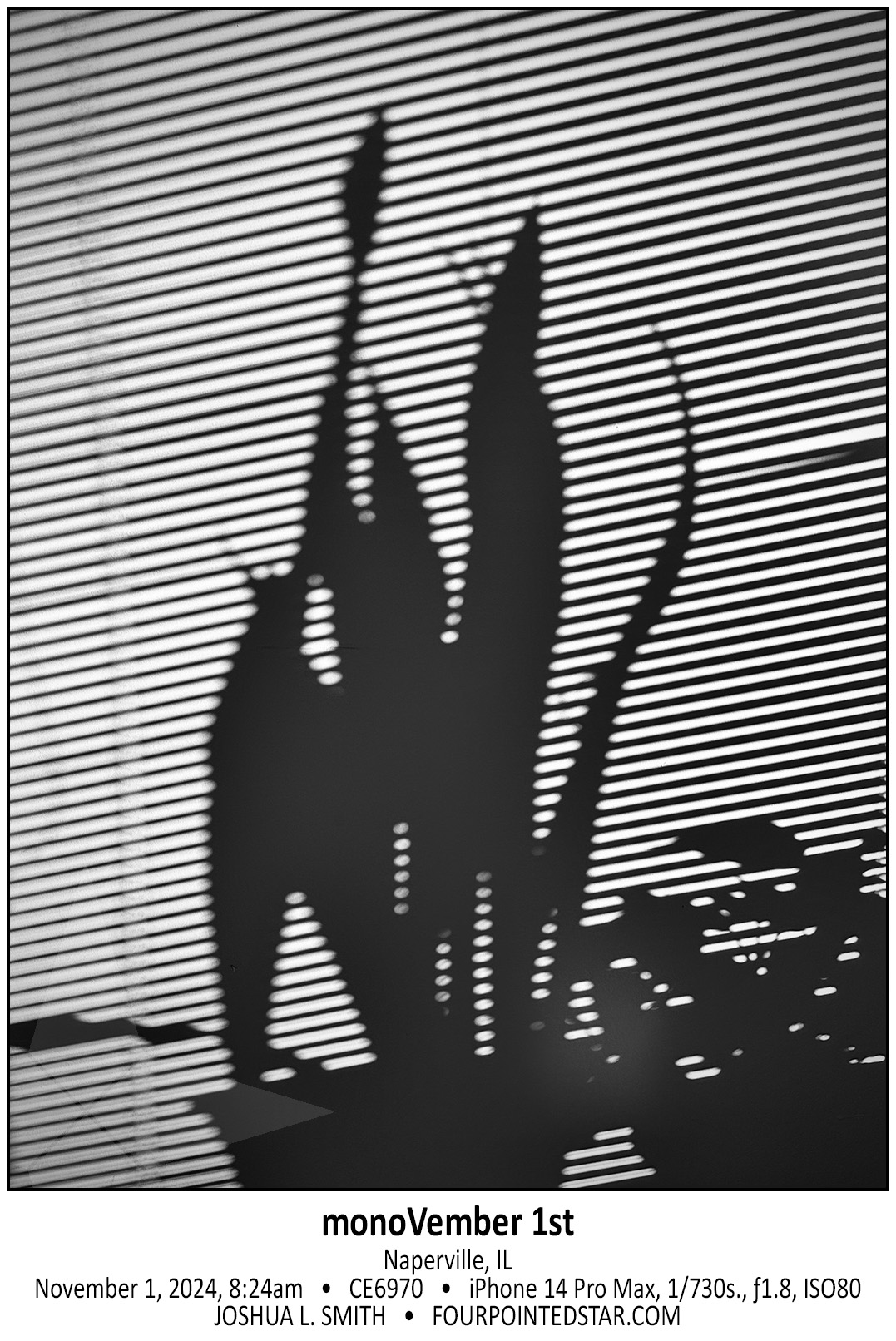
During her interview, Lauri Novak showed us her photo project where she photographed shadows around the house – this photo is an homage to her project!

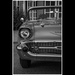
Another wonderful photo from the Elgin History Museum’s annual Classic Car Show. Everyone knows what a 1957 Chevy Belair looks like, so it’s always challenging to find a unique take on this incredibly classic of the classic cars. But, if there’s a late 60’s muscle car with awesome rims next to it? Well, now that’s kinda unique.