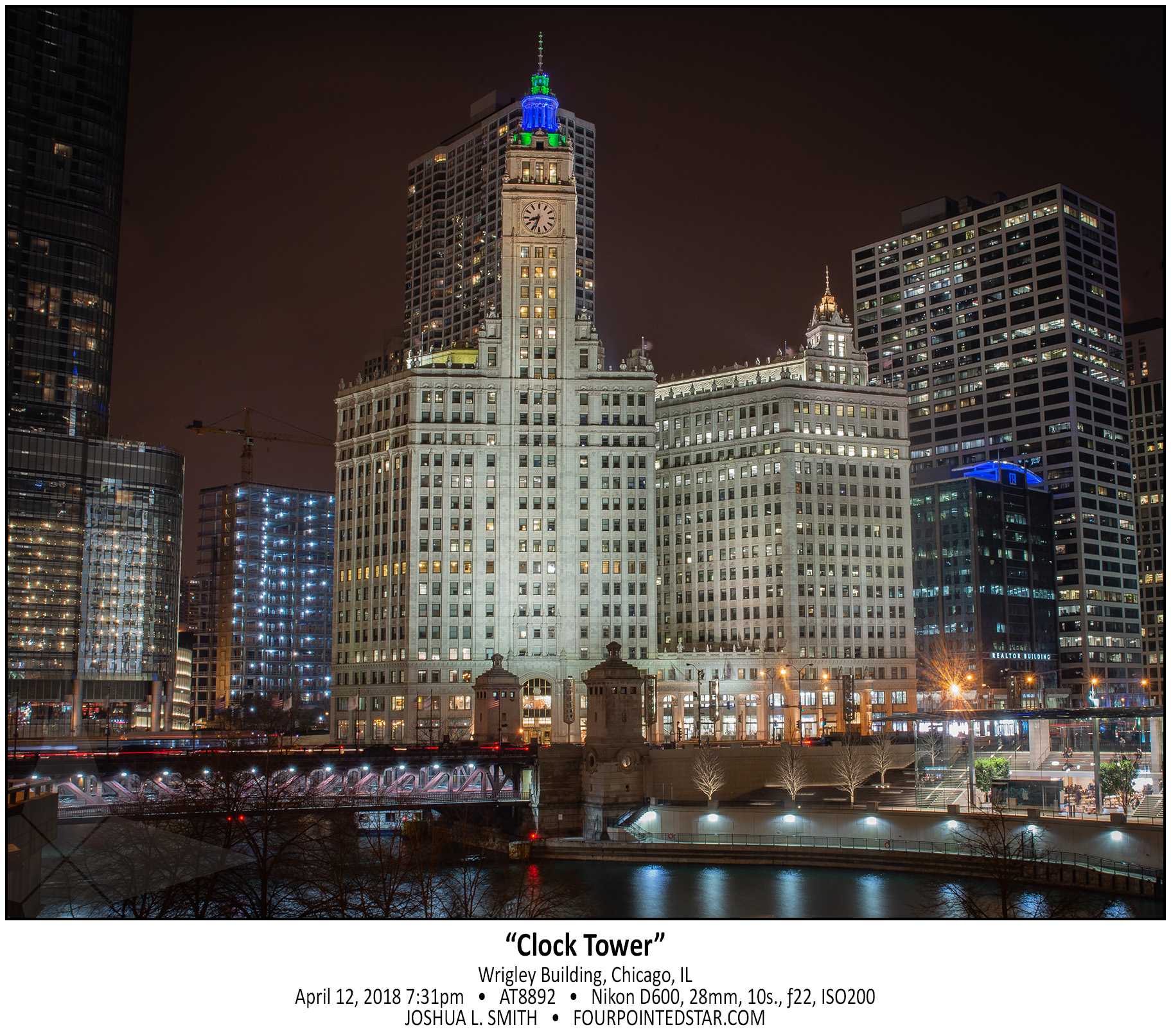
Select “SEE MORE” in the white bar below for an brief explanation of my editing process for this image.
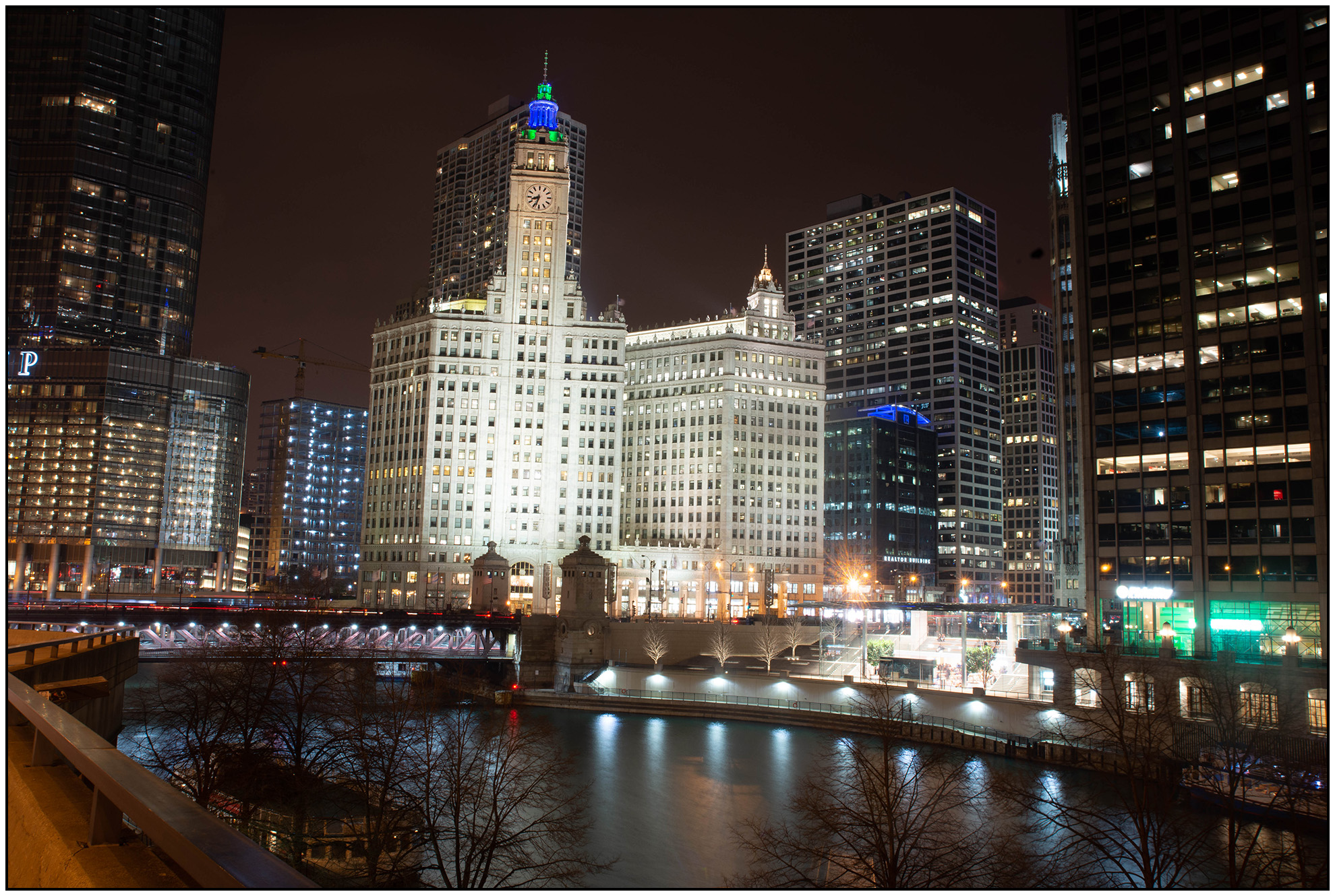
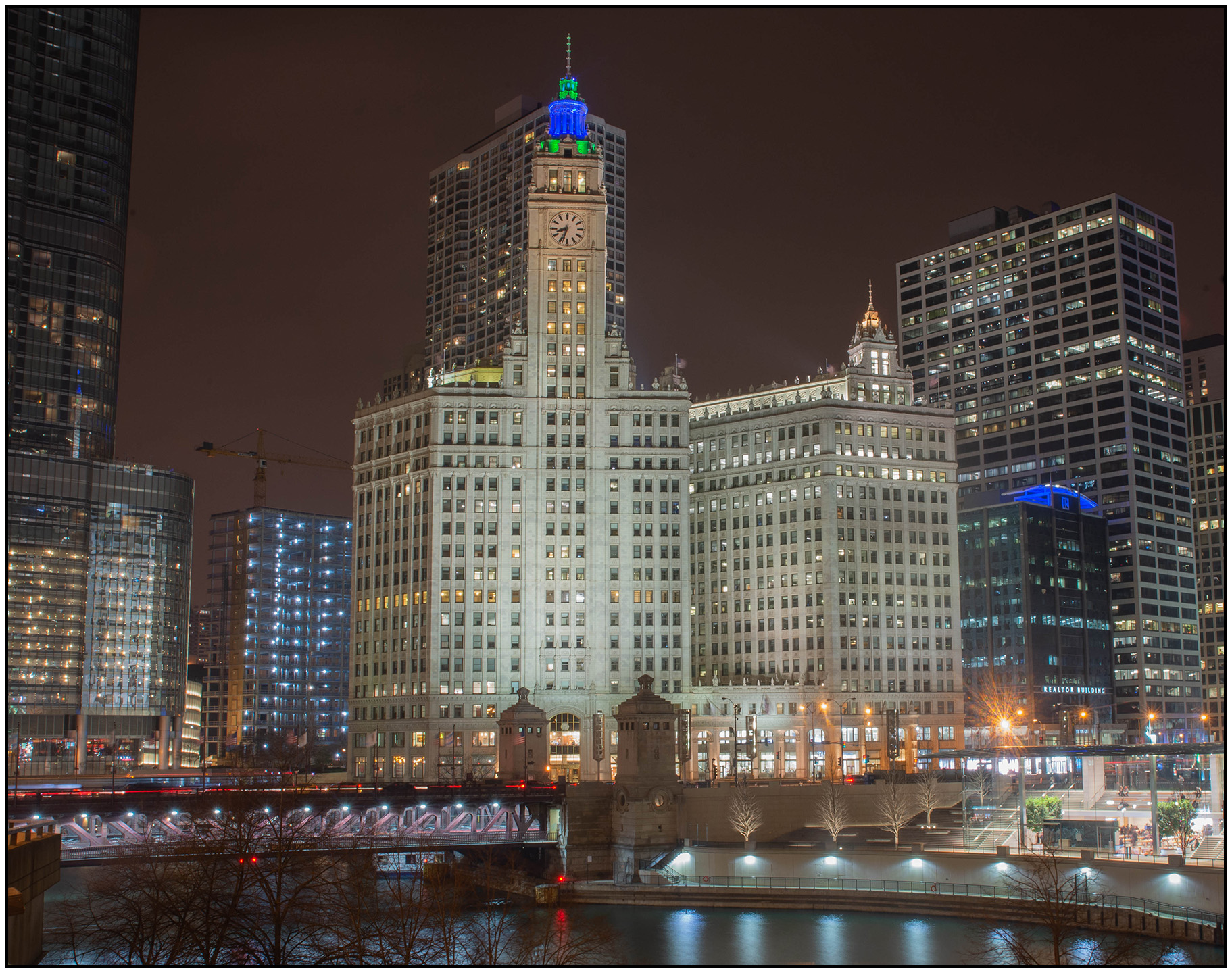
…original image, straight out of camera…
This image from April 2018 has “good bones” but needs some serious touching up. I love that the Wrigley Building is well lit and the other buildings are not (with the exception of the Apple Store). However, I don’t like that the river is covered by distracting tree branches, the image’s horizon is not straight, and the front of the Wrigley Building is bordering on “too bright”. I also don’t care for the overall crop of the image, there’s too much extra stuff in the image.
With almost all images, I crop and rotate first. Cropping is a matter of removing distracting items on the edges of the image and forcing the viewer to focus on the composition that you intend.
Rotation can be tricky. In most cases, the horizon should be a parallel line with the bottom of your image frame; however, with wider lenses, you will also need to judge by how the image “feels”. Often, getting the horizon right is about making sure that the viewer isn’t distracted by the horizon and doesn’t even notice it at all. If the horizon is only off by a very small amount, it can make a BIG difference.
(rotated -2.33°; cropped about 35% in from the right and 20% in from the bottom)
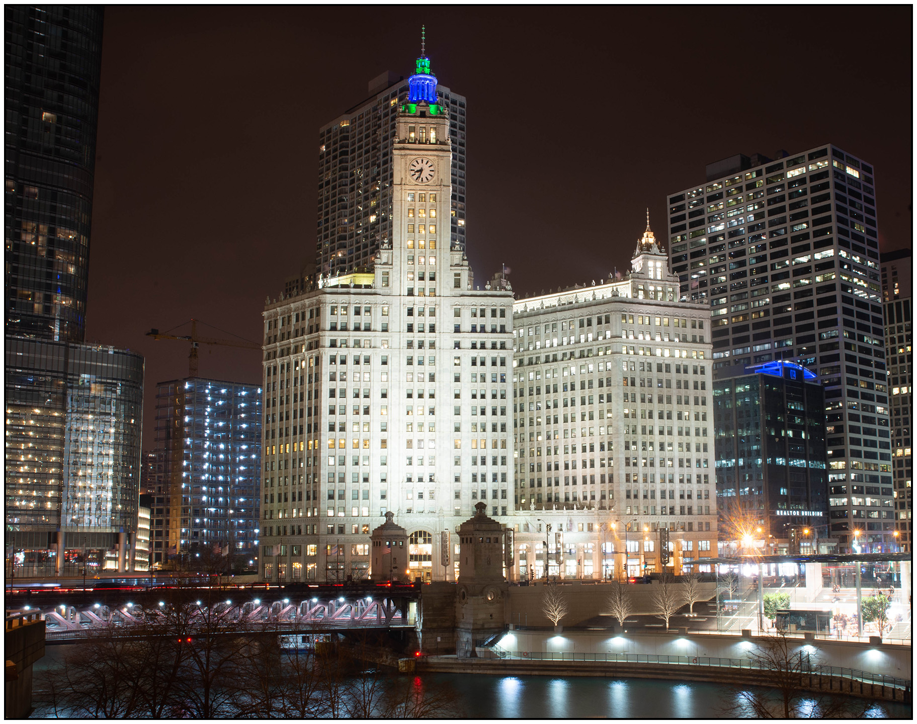
Now that I’ve cropped and straightened, I can see more of what captured my eye when I captured the image. However, some of those other problems are more obvious, and new ones have shown up as well. The Apple Store (lower right) has quite a bit of glare, but I’ll fix that in a couple of steps.
The first thing to fix is to even out the brightness. Most often, I begin by either brightening the dark areas or dimming the bright ones. In this case, I toned the Highlights and Whites almost a full stop each. Then I brought the Shadows and Blacks up by a quarter stop each. Once that was done, the image was still a bit dim, so I increased the Exposure by about a quarter stop.
(exposure +.20; Highlights -83; Shadows +25; Whites -100; Blacks +31)
Now that the exposure is mostly corrected, the Michigan Avenue Bridge stands out and the darker details are not as muted. However that “glare” and “dull brightness” is pervasive, especially on the Wrigley Building – the focus on my image.
The easiest way to describe “Dehaze” practically is to say that it removes grey by adding contrast and saturation. As with all saturation tools, a little goes a long way for changing how an image “feels”. Using Dehaze on this image will allow the muted tones to stand out.
Additionally, Clarity will add sharpness to the midtones of the image. With Dehaze and Clarity added to the image, the Wrigley Building appears to have much more detail and less of that “dull brightness”.
Lastly, I will add Sharpening to the entire image to accentuate the tiny details.
(clarity +27; dehaze +25; sharpening amount 81)

The final step for most of my architecture images is a bit of vignette; and with this image in the original edit from April 2018, I added a heavy, dark vignette.
(post-crop vignetting, amount -20)
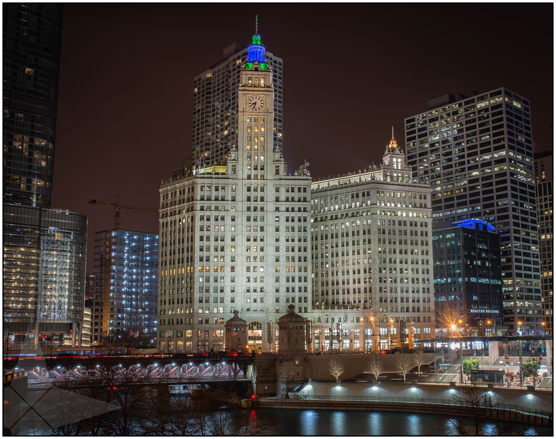
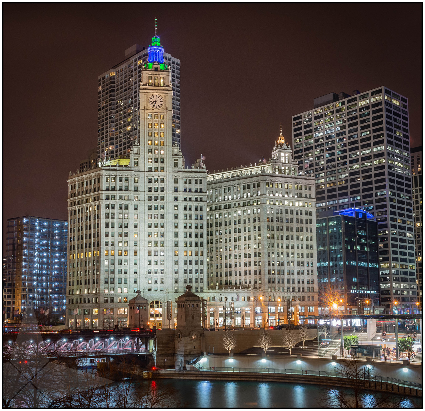
I really like this image, but now, 2 years after the first edit, I believe that a few updates will make it even better:
• bring the crop in tighter from the right, removing all of Trump Tower, but extended the cop a bit to include a bit more river
• ever so slight adjustment to the horizon, now -2.18°
• brighten the overall image another +20
• boost the shadows to +66
• boost the clarity to +47
• increase the overall saturation +10
Lastly, I removed the crane with the spot heal tool. While my original image and edit were compelling, I’m even happier with this second “final” image.